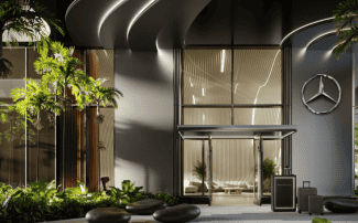
3 Design Strategies for Multifamily Investors
![]()
We like to use the term “adaptive reuse” in describing much of the work undertaken by my Chicago-based company when we purchase and renovate nondescript, mid-century buildings in aging parts of the city that have fallen into disrepair over the decades.
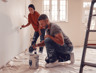
There are things you can and can’t do. Concrete structures with units that have 8-foot ceilings can’t magically be transformed into 10-foot-high grand palaces. But we can, for example, move around interior walls to create rooms that work for today’s lifestyles, rip out carpeting that’s covering beautiful hardwood, patch and paint the walls for a major refresh and, if we happen to still encounter any in 2019, peel off aging psychedelic wallpaper.
We see properties and relish the challenges therein, looking at what we need to work around and how we can make them work―always with the end user in mind. We try to gauge as precisely as possible what people want and what’s expected in today’s market, and then try to meet or exceed those expectations in distinctive fashion. Designs that enhance both the livability and aesthetics of a unit and building play key roles in meeting those goals and becoming sticky in the minds of rental prospects. After all, you want your place to stand out after someone has seen a dozen or two potential properties that otherwise all blend into one another. And there are probably a dozen or two different things you can do, design-wise, to accomplish that aim. I will share three design strategies our design staff employ to improve our properties:
UPGRADE KITCHEN HARDWARE AND BACKSPLASHES
When we upgrade units, we often install all new, stainless steel appliances and new cabinets. If the cabinets are in great shape, we swap out the hardware with modern knobs and pulls to help give the kitchen an updated look. We almost always also install a white, subway-tile backsplash that’s easy to clean. It’s likely prospective tenants will look at that backsplash and wonder why they haven’t had one before, instead of fighting to wipe cooking stains off of their paint (or, heaven forbid, wallpaper). You’ve already got tilers doing everything else, and this way you don’t need to do more than re-grout in another five to 10 years. Plus, these are little details that make your unit feel like a home.
MAKE THE MOST OUT OF SMALL SPACES
This starts with the lobby, which is a different size in every building. But lobbies are great places to meet your neighbors, greet your friends, wait for a Lyft or hang out while you’re waiting for your laundry to finish. Instead of putting in one bench and saying, “It’s small, and I’m done,” we work to make lobbies comfortable to hang out in. Even if it’s just a built-in bench, two chairs, a nice coffee table, a rug and some magazines―these touches make a difference.
Inside units, we think in terms of bathroom spaces and closets. We generally rip everything out in the bathroom and put in new floor tile, plumbing and shower surround. And then of course you need a vanity―not just a sink hanging off the wall. Women, in particular, want to have that set-up space on top and storage underneath for an uncluttered feel―especially in units that lack a linen closet. When it comes to closets, we always try to do more than just the bar at the top and one shelf. We often have a closet consultant come in and put together a plan using shelves, cubbies and other dividers. Then, all of a sudden, tenants can fit twice as many belongings. In units that have a closeted washer and dryer, we put a shelf above the appliances. All provide ways to make smaller units have more appeal and functionality.
ADDING COLOR TO CATCH A PROSPECT’S EYE
We’re always trying to re-envision buildings we’ve just purchased. The “before” picture often features that dreaded ‘90s, nothing-but-beige color palette. There’s no question that if a prospect sees 10 or 20 buildings, and they’re all the same shade of off-white with the same unstained floors, all the units become a confusing blur by the end. We often turn to a very pale, warm grey color that the home networks refer to as “griege.” It’s a pretty, co-ed color and, much like a black pair of shoes, complements whatever combinations of belongings the potential tenant brings―sofa, chairs, rug, etc. You can’t necessarily please everyone, but this color and the accents we use often work well for the majority of people. A corollary to a distinctive yet utilitarian color would be upgrading lighting. We do so both in lobbies and hallways and then inside units. We use sharp-looking brass as well as polished and brushed nickel fixtures that splash nicely onto everything else in our design scheme.
In the big picture, you need to pre-plan all of these aspects of redesign. You need to ask how you can make your spaces more livable and more attractive. Whenever we can add a linen closet or a coat closet, we do. We almost always totally re-do the kitchen layout to make better use of space―pulling the counter out a little or creating an island of some sort. Bottom line: You need to look at what’s there and ask yourself, “How can we make this work and look better?” And do it within a budget while ensuring you’ve done all you can to catch a prospect’s eye and imagination.
Source: multihousingnews.com


 Accessibility