Avoid These Mistakes When Creating A Website For A Rental Property
Posted on Dec 13, 2017
A landlord website can decrease your advertising expenses by attracting a steady stream of applicants to your available units. While a website can benefit you, it’s easy to make costly mistakes if you don’t provide helpful information. Read on to learn mistakes to identify when building a landlord website, then get tips for building a rental website. 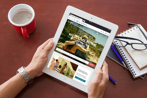
Rental Property Website Mistakes
The biggest mistake landlords make when creating a website is forgetting their core audience. The website is for prospective and current renters, not for you or your property manager. Your website should target your audience of renters and provide helpful information including available units, amenities and high-quality photos.
Not optimizing for mobile access is another top mistake. Renters may be searching for apartments or double-checking your address on their smartphones. If they can’t see your website clearly from their devices, they’ll have a negative first impression of your property.
Using poor photos or subpar website copy will turn off potential renters. If you aren’t a great writer, hire someone to write your rental property descriptions. If you don’t have clear photos of units, hire a photographer. Since you pay once for this service but can re-use this every time you need to advertise the rental, these one-time expenses add value to your site.
When choosing web design templates and colors, consider whether colorblind or visually impaired readers will be able to understand your website. Red-green colorblindness, for instance, makes it difficult for readers to distinguish red from green. If your links are red, readers may pass right by them.
Tips for Creating a Rental Property Website
By following this advice on how to build a rental property website, you can develop a high-quality website that delivers a positive impression from a renter’s first visit. This can increase a renter’s excitement about your listing, which can decrease your vacancy rate by getting available units filled quickly.
Organize your website so it’s easy for renters to find answers to commonly asked questions, complete an application online, and view property descriptions and photos. An organized website uses clear labels and looks neat, not cluttered. When looking at the page, renters should understand what to do next, such as complete an application or call to schedule a viewing. Use clear language to describe call-to-action buttons — for instance “complete an application” instead of “click here.”
Avoid the temptation to use stock photos of properties on your website, as this leads to false expectations. Display attractive and up-to-date photos of your common areas and apartments. The best photos take advantage of natural light to show rooms in clean condition. Rather than photograph empty units, stage apartments with furniture to give a sense of scale. Add captions for all photos so people know what they’re seeing.
When writing about your rentals, choose your words carefully to avoid being accused of discrimination. The Fair Housing Act prohibits landlords from stating preferences for certain types of tenants (e.g., using religious language or stating a gender preference). Steer clear of phrases such as “preferred,” “perfect for” or “ideal for” to accidentally imply that you have a preferred renter in mind.
If you liked this advice, consider joining American Apartment Owners Association. As a member, you’ll receive valuable information on rental marketing, tenant screening and other topics. You’ll also get discounts on office supplies, tenant screening packages and customizable landlord-tenant forms. Explore all member benefits or join AAOA today.
Disclaimer: All content provided here-in is subject to AAOA’s Terms of Use.


 Accessibility